'Symphony'
a Topology of Musical Topographies, attenuating noise, one note at a time.
Formwork Design :
As Sound walls are known for their mundane unappealing aesthetics, we looked at creating a system that was generative allowing us to create 'Sound Panels', where aesthetics were derived from another system and have an underlying appeal. & whats better to use 'Music' in the creating of 'Sound Panels'. So we designed a system to translate sheet music (notes) into the operation of our formwork. Therefore the logic of the 'notes' in the sheet music was translated into the surface / Musical topographies using the location of the pegs and their respective heights.
a Topology of Musical Topographies, attenuating noise, one note at a time.
 |
| Hold your breath, & feel the Earth Hold your breath, & hear the Music - Vision for Metro North - |
Symphony is a design project that uses fabric formworks to cast acoustic panels. The aim of the project was to fabricate facade panels, that are both aesthetic and performative. We approached the project, equally from both ends. On the aesthetic side, we designed a musical typography that allowed us to embed a wave like topography of different musical notes in the physical form of our panels. On the performative side, we studied sound wave motion and designed a surface that would help attenuate sound waves. As concrete is a good reflector of sound, embedding an attenuating surface in the form, would make it a fairly good acoustic panel.
Performative :
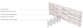
After a basic study of sound waves, we set a design problem for the best surface typology that would dissipate / attenuate / reflect sound waves. We solved this by incorporating a 2 tier approach. First, we created a wave like topographical surface that offered a continuous terrain of high and low points. By creating a surface of varying depths, we would allow greater wave modulation and hence attuate the wave flow across the facade. Second, as sound waves are longitudnal, we wanted to incoporate perpendicular offsets in the panels, that would act as wave breakers. The two were achieved by first using 'Pegs' to be able to create a wave like topography across the panel's surface and second, using strings across the horizontal length of the panel, which would leave an impression of horizontal bands/ lines on the form.
Formwork Design :
We built a wood formwork incorporating the idea of Pegs & Strings. In our first attempt, we used a thicker stainless steel cable which was screwd onto the wooden framework. However, in our final design, we used 'fishing wire' which were then attached to the edges through eyelet screws, that would allow us to tune the strings.
Aesthetic :
.
Parametric System:
We created a parametric software in CATIA, that would help us generate the different topographies. This acts as a simulation model that uses splines. Although, the ideal situation would be using ncloth to generate these topographies, we used CATIA for it's systematic approach. Curretly, the system was more for our own experimentation and drawing generation. The idea was that it would allow us to quickly visualize a facade from sheet music. The formwork which maps one music measure was linked to CATIA via EXCEL. Sheet music 'notations - number values' could be input into excel, that would then generate a topography through splines.
 |
| Topography Generation - Demonstration |
So what Music do we use for our Sound WALL ?
Sky fALL !!! Sky fALL !!! Sky FALL !!!
Decision Made :)
Music Mapping :
Each Music measure equates to 1 cast on our formwork. Here's how it goes...
From our Parametric System :
& That's how we build.... A Symphony !!
Uh ! enough explaining ---- here's what we did :)
CASTING is Fun...
CAST 1
For this pour, we did it in two parts - Obviously ran out of plaster :) The holes (indents) were too prominent. Also, the stainless steel cable was less rigid and seemed to be moving a lot more than we intended it to.
CAST 2 :
Atleast we could cast in one go. Here to have a more prominent varying surface, we added extra sand, so the plaster could sink deeper. Bad Idea -> It resulted in these enormous cracks
CAST 3 :
This was quite beautiful of our attempts :) For this we had switched to fishing wire and special hooks on the top of pegs, allowing for smoother transition. The edge condition was still rough as we probably needed more plaster
CAST 4 :
This is it ! We now changed the location of the strings so the inset could be straight. This created a good result between the topography and the straight lines. Finally, we were getting to our panel -> both aesthetic & performative. BUT then...
CAST 5 :
We switched to ROCKITE.
We didn't take into account the added weight. The result was our fabric sank. Unexpected, so we couldn't tune it either. The missing object in the frame above have now become our special 'Kit of Parts - Display Table'.
CAST 6 :
No hopes lost. We decided to cast again with rockite but 'intelligently'. We fine tuned the system so that if we really felt the fabric was going to sag more than we want, we could use the string tuning method to control. Furthermore, we poured really slowly, so that it wasn't putting too much weight at once. The 'pouring' in intervals, created these interesting patterns on the surface 'almost like a pattern with embedded pour history'. We tuned slightly during our pour process just to test the limits of our design. It worked - It was indeed a dynamic formwork !
Some More Images of the Final Plaster & Rockite Cast :
Lastly : Our Kit of Parts ... from our Rockite Fail Attempt !
Light Studies :
Our FINAL Board :


